Duxedraft®The STudio
September 2021
Inside the DuxeForge: Crafting of A Top-notch Mini-Design System
Design System Development
Brand Documentation
Brand Identity
The DuxeForge Design System serves as a beacon of consistency, enabling me to work seamlessly and collaboratively with others, ensuring that every product reflects my dedication to excellence and creativity. It's not just about design; it's about crafting experiences that resonate with users and other stakeholders while fostering trust and loyalty.
Adobe CC | Pen + Paper | Figma | Visual Studio Code | Bootstrap

whatt’s cookin’
September 2021
Inside the DuxeForge: Crafting of A Top-notch Mini-Design System
Design System Development
Brand Documentation
Brand Identity
The DuxeForge Design System serves as a beacon of consistency, enabling me to work seamlessly and collaboratively with others, ensuring that every product reflects my dedication to excellence and creativity. It's not just about design; it's about crafting experiences that resonate with users and other stakeholders while fostering trust and loyalty.
Adobe CC | Pen + Paper | Figma | Visual Studio Code | Bootstrap
Scroll
Scroll
Creation of
"The Duxe Crest"
Creation of "The Duxe Crest"
Creation of "The Duxe Crest"
The logo is designed from a combination of my nickname (Duke) and a synonym for design (Draft). I also tried to play around with words and changed “Duke’s” into “Duxe” and combined it with "draft" to make a more appealing design for a logotypes. From this combination, “Duxedraft” was born. The logo’s crest appeareance is inspired by nobility from the word Duke and the tip of a fountain pen to signify design and creativity. It also symbolises my (the studios) loyalty and promise to users and other clients.
The logo is designed from a combination of my nickname (Duke) and a synonym for design (Draft). I also tried to play around with words and changed “Duke’s” into “Duxe” and combined it with "draft" to make a more appealing design for a logotypes. From this combination, “Duxedraft” was born. The logo’s crest appeareance is inspired by nobility from the word Duke and the tip of a fountain pen to signify design and creativity. It also symbolises my (the studios) loyalty and promise to users and other clients.
Colour Palette
Colour Palette
Colour Palette
The colours used in this system are designed to match the brand's ethos. Taking inspiration from royal crests and nobility, the Precious Purple colour is used to show luxury, royalty and ambition. The Pepper Red colour is used to show the studio's passion and creative drive while the grey/white variants (Dusty Grey, Pale Grey and Talcum Powder) are used to denote minimalism, purity and balance.
The colours used in this system are designed to match the brand's ethos. Taking inspiration from royal crests and nobility, the Precious Purple colour is used to show luxury, royalty and ambition. The Pepper Red colour is used to show the studio's passion and creative drive while the grey/white variants (Dusty Grey, Pale Grey and Talcum Powder) are used to denote minimalism, purity and balance.
Precious Purple
Precious Purple
Primary Colour
Primary Colour
Applied to all general texts.
Preferred logo colour on lighter backgrounds.
Used on all buttons.
Can be used as darker background for the white logo.
Applied to all general texts.
Preferred logo colour on lighter backgrounds.
Used on all buttons.
Can be used as darker background for the white logo.
Applied to all general texts.
Preferred logo colour on lighter backgrounds.
Used on all buttons.
Can be used as darker background for the white logo.
Pepper Red
Pepper Red
Primary Colour
Primary Colour
Used as an accent colour and in highlighting important texts.
Preferred colour for the logo and brand identity.
Used on button hovers.
Only on lighter backgrounds with larger logo.
Used as an accent colour and in highlighting important texts.
Preferred colour for the logo and brand identity.
Used on button hovers.
Only on lighter backgrounds with larger logo.
Used as an accent colour and in highlighting important texts.
Preferred colour for the logo and brand identity.
Used on button hovers.
Only on lighter backgrounds with larger logo.
Dusty Grey
Dusty Grey
Tertiary Colour
Tertiary Colour
Background colour for the side menu.
Can be used on texts in the footer section.
Preferred colour for inactive items.
Background colour for the side menu.
Can be used on texts in the footer section.
Preferred colour for inactive items.
Background colour for the side menu.
Can be used on texts in the footer section.
Preferred colour for inactive items.
Pale Grey
Pale Grey
Tertiary Colour
Tertiary Colour
Can be used on non-interactive items.
Used in section dividers and/or backgrounds.
Applicable to texts used on red/purple backgrounds.
Can be used on non-interactive items.
Used in section dividers and/or backgrounds.
Applicable to texts used on red/purple backgrounds.
Can be used on non-interactive items.
Used in section dividers and/or backgrounds.
Applicable to texts used on red/purple backgrounds.
Talcum Powder
Talcum Powder
Tertiary Colour
Tertiary Colour
Preferred colour for the lighter logo variation.
Applicable to texts used on red/purple backgrounds.
Preferred colour for the lighter logo variation.
Applicable to texts used on red/purple backgrounds.
Preferred colour for the lighter logo variation.
Applicable to texts used on red/purple backgrounds.
Typography
Typography
Typography
The studio uses a minimal type hierarchy of two fonts only, Strawford and Recoleta. Strawford is used as the primary typeface of choice and Recoleta as a secondary typeface that brings diversity in the overall hierarchy.
The studio uses a minimal type hierarchy of two fonts only, Strawford and Recoleta. Strawford is used as the primary typeface of choice and Recoleta as a secondary typeface that brings diversity in the overall hierarchy.
The studio uses a minimal type hierarchy of two fonts only, Strawford and Recoleta. Strawford is used as the primary typeface of choice and Recoleta as a secondary typeface that brings diversity in the overall hierarchy.
Primary Typeface
Primary Typeface
Strawford is used everywhere in all body, buttons and sub-header texts.
Strawford is used everywhere in all body, buttons and sub-header texts.
Strawford is used everywhere in all body, buttons and sub-header texts.
abcdefghijklmnopqrstuvwxyz
abcdefghijklmnopqrstuvwxyz
abcdefghijklmnopqrstuvwxyz
abcdefghijklmnopqrstuvwxyz
abcdefghijklmnopqrstuvwxyz
abcdefghijklmnopqrstuvwxyz
0123456789.
0123456789.
0123456789.
Regular
Regular
Regular
Medium
Medium
Medium
Bold
Bold
Bold
Black
Black
Black
AaBbCcDdEeGgNn 1234567890
AaBbCcDdEeGgNn 1234567890
AaBbCcDdEeGgNn 1234567890
AaBbCcDdEeGgNn 1234567890
AaBbCcDdEeGgNn 1234567890
AaBbCcDdEeGgNn 1234567890
AaBbCcDdEeGgNn 1234567890
AaBbCcDdEeGgNn 1234567890
AaBbCcDdEeGgNn 1234567890
AaBbCcDdEeGgNn 1234567890
AaBbCcDdEeGgNn 1234567890
AaBbCcDdEeGgNn 1234567890
Secondary Typeface
Secondary Typeface
Recoleta is mainly used for titles because of it’s bold appearance.
Recoleta is mainly used for titles because of it’s bold appearance.
Recoleta is mainly used for titles because of it’s bold appearance.
abcdefghijklmnopqrstuvwxyz
abcdefghijklmnopqrstuvwxyz
abcdefghijklmnopqrstuvwxyz
abcdefghijklmnopqrstuvwxyz
abcdefghijklmnopqrstuvwxyz
abcdefghijklmnopqrstuvwxyz
0123456789.
0123456789.
0123456789.
Regular
Regular
Regular
Medium
Medium
Medium
Semi Bold
Semi Bold
Semi Bold
Bold
Bold
Bold
Black
Black
Black
AaBbCcDdEeGgNn 1234567890
AaBbCcDdEeGgNn 1234567890
AaBbCcDdEeGgNn 1234567890
AaBbCcDdEeGgNn 1234567890
AaBbCcDdEeGgNn 1234567890
AaBbCcDdEeGgNn 1234567890
AaBbCcDdEeGgNn 1234567890
AaBbCcDdEeGgNn 1234567890
AaBbCcDdEeGgNn 1234567890
AaBbCcDdEeGgNn 1234567890
AaBbCcDdEeGgNn 1234567890
AaBbCcDdEeGgNn 1234567890
AaBbCcDdEeGgNn 1234567890
AaBbCcDdEeGgNn 1234567890
AaBbCcDdEeGgNn 1234567890
Components
Components
Components
A collection sample of several assets used in Duxedraft Studio’s website. These include buttons, footers, and cards as they apply to all devices in responsive breakpoints.
A collection sample of several assets used in Duxedraft Studio’s website. These include buttons, footers, and cards as they apply to all devices in responsive breakpoints.
Buttons
Buttons
All buttons should be accessible by following the guidelines provided in the colour scheme . Buttons are the primary call-to-action elements in this design system and links will be used where buttons won't work. However, links should never be used as a primary call-to-action when using this system.
All buttons should be accessible by following the guidelines provided in the colour scheme . Buttons are the primary call-to-action elements in this design system and links will be used where buttons won't work. However, links should never be used as a primary call-to-action when using this system.
All buttons should be accessible by following the guidelines provided in the colour scheme . Buttons are the primary call-to-action elements in this design system and links will be used where buttons won't work. However, links should never be used as a primary call-to-action when using this system.
Idle Button //
Idle Button //
Button Hover //
Button Hover //
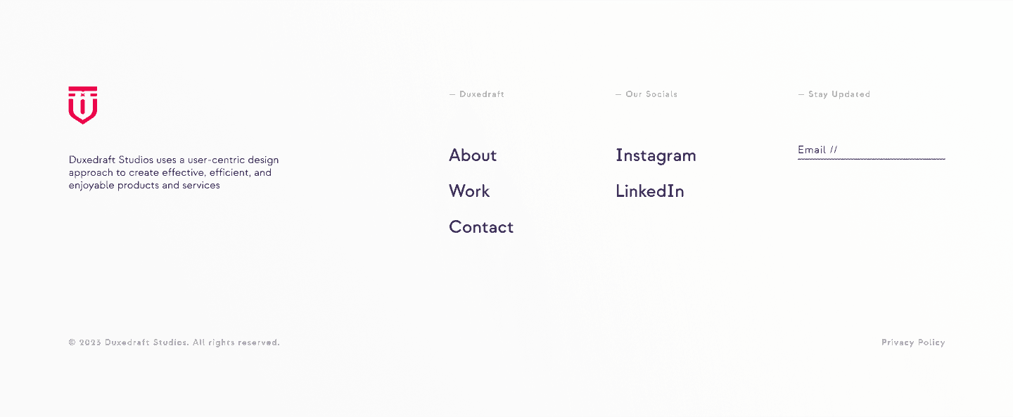
Footers
Footers
A responsive footer is also included on all pages in this design system. Only the logotype should be used in the footer and social media icons should follow the colour scheme. All texts used in the footer should be accessible by following the guidelines provided in the colour scheme. Only the logotype should be used in this section without the logo. Logotype and icons should also be in a darker colour for accessibility. The footer should be included in all pages to protect the content with copyright.
A responsive footer is also included on all pages in this design system. Only the logotype should be used in the footer and social media icons should follow the colour scheme. All texts used in the footer should be accessible by following the guidelines provided in the colour scheme. Only the logotype should be used in this section without the logo. Logotype and icons should also be in a darker colour for accessibility. The footer should be included in all pages to protect the content with copyright.
A responsive footer is also included on all pages in this design system. Only the logotype should be used in the footer and social media icons should follow the colour scheme. All texts used in the footer should be accessible by following the guidelines provided in the colour scheme. Only the logotype should be used in this section without the logo. Logotype and icons should also be in a darker colour for accessibility. The footer should be included in all pages to protect the content with copyright.


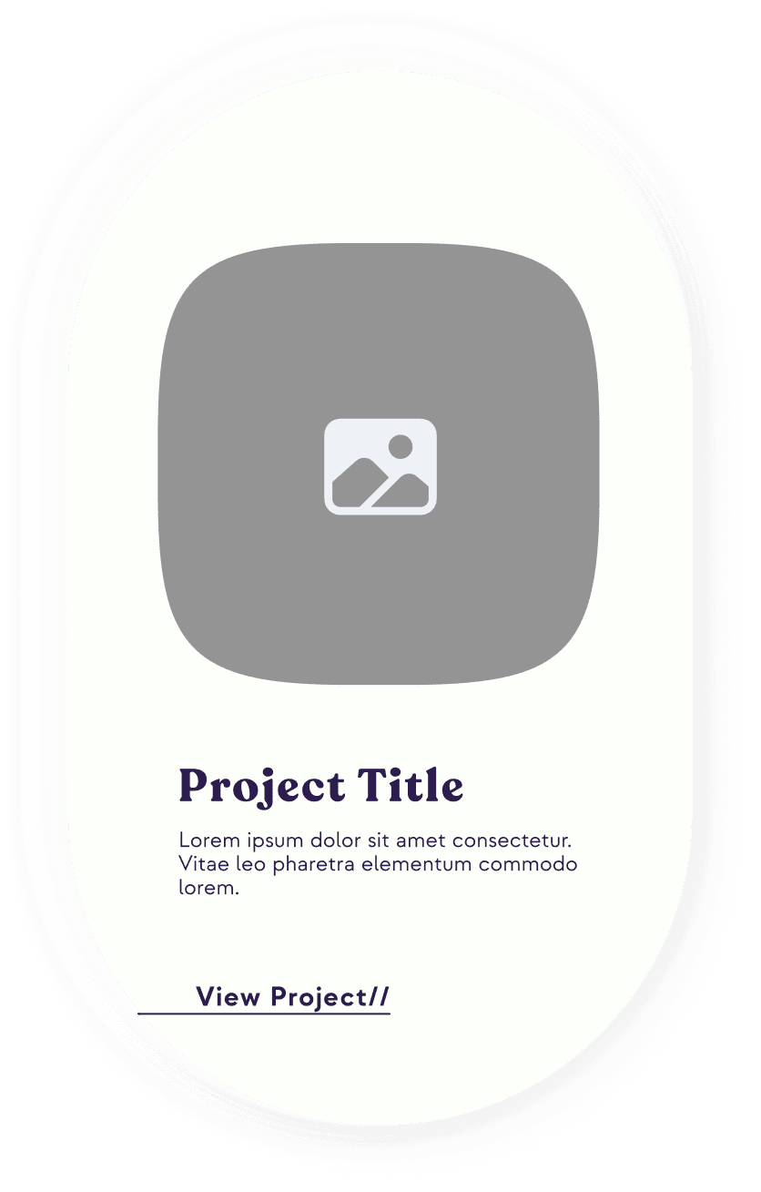
Cards
Cards
Cards
All buttons used in the cards should be accessible by following the guidelines provided in the colour scheme. Project descriptions should be brief at a maximum of three sentences. Cards can be used to highlight featured projects on the landing page and in the projects section. Cards are to be used for project presentation only and should include a hero shot, project title, brief description and button. Below are the card designs for desktop, tablet and mobile respectively.
All buttons used in the cards should be accessible by following the guidelines provided in the colour scheme. Project descriptions should be brief at a maximum of three sentences. Cards can be used to highlight featured projects on the landing page and in the projects section. Cards are to be used for project presentation only and should include a hero shot, project title, brief description and button. Below are the card designs for desktop, tablet and mobile respectively.
All buttons used in the cards should be accessible by following the guidelines provided in the colour scheme. Project descriptions should be brief at a maximum of three sentences. Cards can be used to highlight featured projects on the landing page and in the projects section. Cards are to be used for project presentation only and should include a hero shot, project title, brief description and button. Below are the card designs for desktop, tablet and mobile respectively.


Grids + Specs
Grids + Specs
Grids + Specs
Screen patterns are designed using a 12 column grid to ensure responsive interface interactions on desktop, tablet and mobile. Dimensions are also included to show how elements relate to each other on the screen. For demonstration, the landing page is used to showcase the application of the grid and specs across devices.
Screen patterns are designed using a 12 column grid to ensure responsive interface interactions on desktop, tablet and mobile. Dimensions are also included to show how elements relate to each other on the screen. For demonstration, the landing page is used to showcase the application of the grid and specs across devices.
Screen patterns are designed using a 12 column grid to ensure responsive interface interactions on desktop, tablet and mobile. Dimensions are also included to show how elements relate to each other on the screen. For demonstration, the landing page is used to showcase the application of the grid and specs across devices.
Grid
Grid
Grid
A 12 column grid system as it applies to desktop (left), tablet (middle) and mobile (right) and each responsive breakpoint.
A 12 column grid system as it applies to desktop (left), tablet (middle) and mobile (right) and each responsive breakpoint.
A 12 column grid system as it applies to desktop (left), tablet (middle) and mobile (right) and each responsive breakpoint.


Spec
Spec
Spec
A 12 column grid system as it applies to desktop (left), tablet (middle) and mobile (right) and each responsive breakpoint.
A 12 column grid system as it applies to desktop (left), tablet (middle) and mobile (right) and each responsive breakpoint.
A 12 column grid system as it applies to desktop (left), tablet (middle) and mobile (right) and each responsive breakpoint.


